Showing posts with label hanging. Show all posts

Wednesday, August 11, 2010

Exhibition Pictures

So, at last here it is in situ under the church tower.  I decided to call it 'Glimpsing the Storm' to make the connection with St Nicholas as patron saint of sailors. I rather like the way it has no visible support from the front as the pole is hidden.

You can also see 'Cogitation' on a low stand and other pieces hanging on boards - you may remember some of these from earlier posts.  And the good news is that one of the collages has sold.


Sunday, August 01, 2010

Exhibition Details

Exhibition Mon August 9th to Sat August 14th
St Nicholas church, Westgate Street, Gloucester, GL1 2PG

I will be showing my hanging and some other pieces, there is also a quilt exhibition called 'Quilted Jewels' and engravings by Sarah van Niekerk.  The church is very near the cathedral and will be open 10:30am to 4:00pm each day and admission is free, however it is being used for a lecture on Monday 9th at 1.30pm and  a concert on Weds 11th at 2.00pm.  This exhibition is part of Three Choirs Plus running alongside the Three Choirs Festival so there will be lots going on in Gloucester all week - well worth a day trip if you are in the area.  See http://www.3choirs.org for more info

Still no pics of the finished item  - somehow whenever it is not raining (or threatening to rain) it is really windy so I can't get the hanging to keep still.  I will try and get some good shots in situ.  Meanwhile, back to double and triple-checking everything is ready.

Thursday, June 24, 2010

A Hanging - but is it finished?

I've spent the last week attacking the hanging with pin tucks.  I laid it on the floor to see how it was going and took a photo.

Photo 1   
Then I put it on the table to start sewing - it was scrumpled up to keep it from hanging over the edge and I realised it looked much better like that, so I played with it on the floor and decided I prefer the way it looks  - see below.

Photo 2


OK not really like a crack but nice and stormy.  Does it still count as a hanging if I display it on the floor?  It is a lot shorter like this - about 1.5m.  Not sure if it is finished so I am going to put it aside for now - I will be seeing Sian at summer school and get her advice.

A quick plug for anyone who doesn't already know - the Urchfont Manor open day is on Sunday 4th July and there will be exhibitions of work from the various textile courses there, including Distant Stitch students as well as traders.  I will be there all day so come and say hello.  The manor is set in its own grounds in  the village of Urchfont near Devizes, Wiltshire and is a lovely place for a day out especially if the sun is shining.

Thursday, June 10, 2010

Thoughts on Colour

I had been thinking for a while that there was not enough difference in the tones of the colours on the hanging, so yesterday I used Markal sticks to lighten the large pale patch and touch up other areas and then carried on stitching.  The pictures below show in greyscale the untouched fabric and its current state - not a huge difference but a bit more contrast.  It also shows how the shadows from the tucks are adding darker areas - for now, I am leaving the lighter part untouched.

Untouched fabric 
After painting  and some tucks.

Tuesday, June 08, 2010

Brief for Site Specific Hanging


The Brief

To produce a hanging for an exhibition at St Nicholas Church, Gloucester as part of the Three Choirs Festival in August 2010.

The Site

St Nicholas is a church located in the centre of Gloucester, a short walk from the cathedral, and dates back to the 12th century. It is no longer used for services but remains consecrated and is open to the public in spring and summer, frequently hosting art exhibitions. The church is noted for its pronounced lean which can be clearly seen when you stand in the nave – the pillars on the north side lean outwards as does the archway. During the week-long festival, there will be an exhibition of quilts in the centre nave and other artwork under the tower, along the north wall and on pews - this is where the hanging will be. The church will also be used for a number of music workshops and concerts.

Special Considerations

As this is an historic building, there can be no alteration or damage to the fabric of the church i.e. it is not possible to attach hooks or nails to the walls, although anything already there can be used. However, the curator is happy to tie items around the pillars, throw lines over beams or existing cables or hang very large artworks from the tower. In addition, there is a hinged pair of six foot hanging screens available and items can be placed on the floor under the tower, propped against walls and placed on pews.

The building is consecrated so although artwork need not be religious, it must not be offensive or disrespectful of the Christian faith.
St Nicholas Church from Westgate street.

Floor Plan
South window

West Window
My proposal is to place the hanging under the west window - the distance from the windowsill to the floor is 3m - so that it can be seen from the nave.  As I mentioned before, I am hoping it will resemble a crack showing the storm/chaos outside.  The next picture has been reproduced with permission from stnicholaschurchuk.webs.com/ and I have superimposed an image of the hanging to show how it might look.  When I met the curator, we discussed draping it from the windowsill and tying to a hook that is already there but as an alternative if this doesn't look right, I have a telescopic pole which will support it without showing (the kind you see at festivals with banners or windsocks on).

Mock-up of hanging in situ.

Following on from my earlier posts, I have decided to pursue the idea of using tucks to emphasise the design.   As it would be difficult to back the hanging after it has been distorted, I tried another sample with a dark backing to see that the effect with two layers is still what I want.  It does make the tucks appear softer, so in the sample shown below I tried slashing them to add some drama.  You can also see in the lighter section that I experimented with kantha stitching but felt it was too organised
Sample showing slashed tucks on left.
The last picture shows how I have started adding tucks to the bottom half of the hanging  - even with only a few in, you can see how it is starting to change shape.  When I have done some more, I will decide whether to slash some or all and possibly add more colour behind to show through in places.


Friday, May 21, 2010

Thinking Aloud - Ideas for Hanging Part 2

Photo 1
My alternative idea for the hanging involves manipulating the long length of fabric.  Sian suggested looking at gathering or pin tucks so photo 1 shows two trials of gathering with deliberately uneven rows of stitching pulled up tightly. The top one is an offcut with the stitches running vertically, the bottom is one end of a 'spare' full length with stitches running horizontally.  I like the effect but it has two problems - 1) drastically reduces the size and 2) could be any randomly dyed fabric.

Photo 2
Before leaving the samples, I rubbed Markel sticks over the second one (top in photo 2) and then undid it (photo 3).
.Photo 3
Phot 4 shows how it looks when the fabric has flattened out - you can just see streaks of paint.
Photo 4
This didn't look very impressive but it gave me an idea to try random pintucks as I liked the scrunched up effect before the gathers dropped out.  Photo 5 shows a sample  on the same piece of fabric.  I tried to use the pintucks to emphasise the curves in the design.  I realise I forgot to show the scale in this photo, but the fabric is 34cm wide before stitching and the photo shows about 60cm of the length.  The colours have slipped in this picture, in reality it is more of a green/blue.  Photo 6 shows more of the length with the stitched part at the top.  I think this is my favourite as it keeps the design but makes it more dramatic.  Although it will change the shape, it should be possible to retain the general proportion.  I think the shaped edges will make it look more like a crack in the wall (or floor), contrasting the serenity of a church with the storms and chaos outside.

Photo 5

Photo 6

Tuesday, May 18, 2010

Thinking Aloud - Ideas for Hanging Part 1

Photo 1
Back in February, I showed pictures of stitching on a small sample of my design that had been printed by Spoonflower.  I was excited by this so I went ahead and ordered a full length, knowing it would take about 2 weeks to arrive.  Because the design is narrow, it was repeated across the width of the fabric and I choose to mirror it so I have the original, a mirror image and about 2/3 of the width of another copy as it didn't quite fit 3 times.  As the image is not an exact multiple of 1 yard, I also have a partial repeat of the top.  Photo 1 shows the design at full size laid out on the floor.  Meanwhile I had got some feedback from Sian who suggested I try to incorporate more texture and take advantage of the dimensional possibilities.

I spent some time (actually rather a lot) in total inaction because I liked the length of fabric just as it was, and I had to convince myself it would be okay to change it.  I finally screwed up my courage and started cutting up the copies, reminding myself that nothing would be wasted as I can always use more patchwork cushions and the sofa is blue, so that's fine.  I know I should probably play in paper and do drawings but it isn't the same.

As I was feeling stuck, I tried two different ideas simultaneously to see where they would take me.  This post follows one and the next post will follow the other (just as soon as I retrieve my camera from being used for a school project by number 2 daughter).  I have also revisited the planned site with the fabric and measured up and taken photos, so I can produce a  room plan and show how it would look.

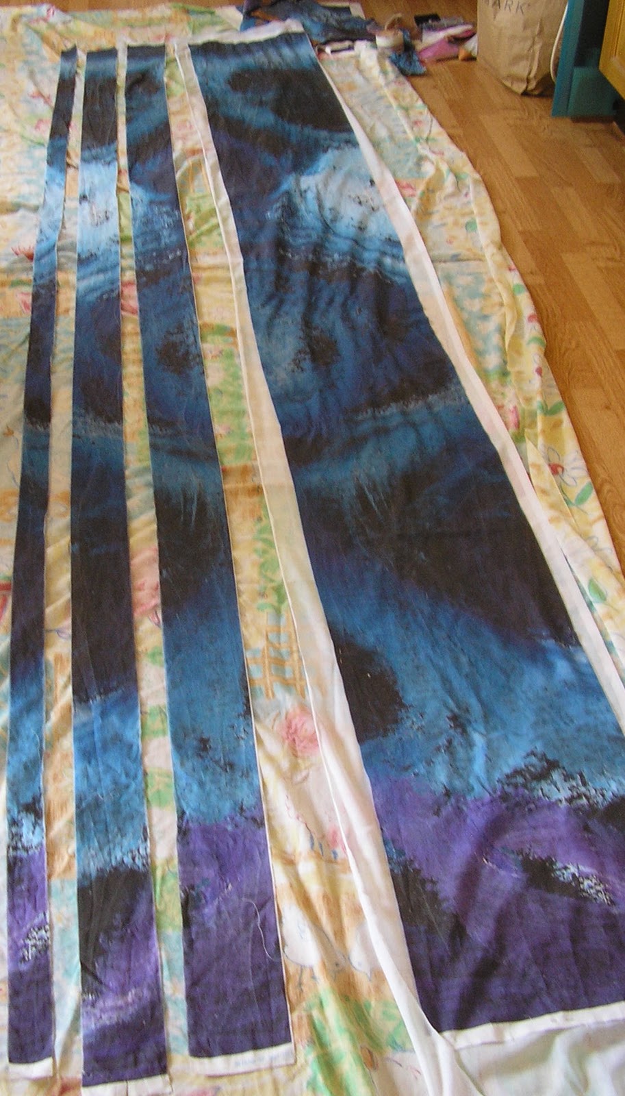
So - photo 2 mirror image cut into strips.

Photo 2
Photos 3 to 6 strips laid on top of original in different arrangements.
Photo 3

Photo 4


Photo 5

Photo 6
Photo 7 - strips sewn together

Photo 7
Photo 8 - here I cut up the excess fabric into smaller rectangles and laid them on the main design, matching the colours and adding a couple of pieces of bronze painted fabric (see earlier post about adding bronze to represent astronomical instruments).  For scale, there is a 10p coin in the bottom right corner (1" diameter).  This and the following photos are 'sketches' which could be continued up to full size.

Photo 8
Photo 9 - similar to 8 but on a plain background.
Photo 9
Photo 10 - This time I arranged the bits in colour order from dark at the bottom to light at the top, completely breaking up the image, but I think keeping the sense of movement in the fragments.  Could be seen as reaching up to the light. I would need to reintroduce the purple/lavender shades as this bit is just blues shading to charcoal.
Photo 10
Photo 11 - I finger-pleated some of the pieces in different directions to make the surface more interesting.
Photo 11

Wednesday, February 24, 2010

More Sampling

Photo 1 is a clearer picture of the stitch sample. Most was done with the fabric stretched on a frame; I did a little in the top left corner without a frame to see the difference.

Photo 1
I had one of those mornings when nothing looks right - feeling doubtful about the design I tried some more variations, see photo 2.

From left to right -a) the circle segments I did a few days ago b) similar but with fewer lines c) trying close parallel lines (like the markings on an astrolabe) d) change of tack - would it look better with long straight lines as a contrast to the swirling background? e and f) variations of d.

Photo 2
Finally, I used the offcut of printed fabric to try adding extra colour with Markal sticks in places in case the printed fabric looks a bit flat over a large area. I also used bronze powder in fabric medium to paint the line, which could be enhanced with couching or stitching to imitate the markings around the edge of a mariner's astrolabe ( see this image from Wikipedia). I have laid the offcut over the stitched sample lining up the print to show the difference.

Photo 3


Monday, February 22, 2010

Sampling for hanging

Carrying on from the last post, I am finally catching up with myself. In between the first day's playing and posting to my blog last week, I decided to explore getting the whole image digitally printed onto one length of fabric by a commercial printer. When I looked into how to do this I was slightly hampered by not having Photoshop which is what is generally used, so I decided to try using Spoonflower. They print short runs and can work from a JPEG, and although the choice of fabrics is limited, their site is very easy to use and there is plenty of community support, with advice on colour matching. Easy for a novice to try!

I had scanned the image at 600dpi so when I enlarged it to full size, it reduced to 150dpi which is what Spoonflower uses. This is quite a low resolution but as there is no really fine detail in the image, it shouldn't matter. As it is, the file is huge so my computer finds it hard work to handle. I uploaded the file and ordered a fat quarter printed on quilting weight cotton as a sample. As the pattern is 3m long, this is just a small piece from the bottom, but at full width (37cm). Photo 1 shows how I have started stitching into the sample, following the swirls. The colour in this picture is fairly close to life.

Photo 1

I spent some time stitching over the weekend - mostly while hanging around at daughters' dance classes on Saturday -and today started thinking about how to make the curved lines in the earlier sketches that represent navigational instruments. Photos 2 and 3 show the sample with various metallic ribbons and wires laid across it to see the effect. I think it will need to be something very bold and with a reflective surface or the hanging will blend into nothing against grey stone walls.

Photo 2
Above - left to right - Copper wired ribbon, gold/orange wired ribbon, lurex ribbon
Below - left to right - Fine tubular knitted wire, narrow gold cord (could be braided?), heavier knitted wire.
Photo 3

None of these are right but from the point of view of showing boldly, the lurex is closest (but ugly) followed by the heavier tubular wire (too narrow and wrong colour). Really, I would prefer a brass or copper colour rather than gold, and I need to see how to vary the effect. In the sketch, the circular segments are solid at the bottom and become lighter towards the top, as does the background.

Now to practical details. I am stitching the sample (which tries out various threads and stitches so is quite random at the moment) on the printed cotton backed with cream cotton. I have a small offcut, so I think I will try with a different backing - perhaps black felt - as a) the stitching is quite heavy and b) white shows through the needle holes. The printed cotton is quite unforgiving of unpicking as it leaves a trail of white holes behind, so I think a dark fabric behind will help. After stitching, the hanging will be backed with a plain toning fabric and the edges turned in. To prevent sagging, I will machine through the layers unobtrusively, eg by going around the edges of the curved lines, and may need to weight the bottom edge. It will hang from a rod at the top either through a hanging sleeve or tabs - I think this will be decided when I have seen the whole thing and depends on what kind of rod. Old brass would be in keeping with the theme. I forgot to mention before that as the image is so narrow, if a length of fabric is printed, it will be repeated across the width, so I will have plenty left over for making mistakes - sorry, more samples.

Thursday, February 18, 2010

Ideas for a Hanging

I have started working on module 4 chapter 1 (study sheets on flowers in Elizabethan and Russian embroidery) but have been diverted into working on a site-specific hanging after being invited to exhibit some work in Gloucester in August. I wrote about this over on Quodlibet but have now decided to make it as one of the assessment pieces for the diploma.

I actually meant to write this blog entry last Thursday while the first thoughts were all fresh, but somehow ran out of time and then carried on working with some ideas. So before I get too carried away (and forget what I was going to say) it is time to get my head together and put it all in writing - I find posting to this blog helps to sort things out for me when the brain is buzzing.

So, I started with two thoughts which I brainstormed 1) I like the idea of a long narrow hanging based on the designs I posted about here and 2) the church (which is no longer in use for services) is dedicated to St Nicholas and I would like to reflect this in some way.

Because of the height of the space available, I want to make something on a large scale. I looked back at the prints I had played with before and found that the one I liked had sides in a ratio of 1:7.6. If the hanging is to be a simple rectangle, it is important that the proportions look 'right' while keeping the long narrow look I am after, so I checked a table of silver means to find the nearest one, which turned out to be 1:8.1231. If I scale this up, I can make a hanging that is 3m long and 37cm wide - large enough to make a statement without becoming unmanageable. To get a feel for working at this scale, I cut a roll of cheap lining paper to size and just scribbled on it with some Markal sticks, making big marks - picture 1.

Picture 1

Going back to the original design, with its swirls of colour on a dark background it looked a little like a night sky so this could tie in with St Nicholas being the patron saint of sailors and giving protection from storms. I played with enlarging and cropping the image again and chose a section that did not have any of the gold lines but had some particularly interesting swirls that suggested chaos and storm clouds. Picture 2 shows the image in the correct proportion.

Picture 2


Next step is to consider ways of getting this image onto fabric - these are the ideas I noted down as possibilities
  • dyed fabric base - could be joined pieces; stitch together and then dye to get colour variations
  • use Markal sticks on midnight blue background, add detail with stitch
  • digital print for background
  • add texture with gesso or crumpled tissue
  • use padded or raised areas
  • discharge colour to get swirls
  • add line sketches of nautical/navigation images - layered
  • is it to be opaque or translucent?
And here are some paper samples printed to scale to play with

Picture 3, left to right - the print untouched, shaped at bottom (don't like this), drawings of sextants and astrolabes.

Picture 3

Picture 4 left to right - astrolabe drawn on print. I thought this was a bit too literal so tried just circle segments to suggest the instruments. On the right I have printed a small part of the background larger and gone over it with Markal sticks. I would like to illustrate or represent the idea of the chaos of a storm being calmed or overcome.

Picture 4.
Picture 5 - another rough sketch on a small piece printed full size.

Picture 5

Picture 6 - I took two of the papers from picture 4 and stuck them up outside so I could see them from a distance - the larger one is not quite at full width.

Picture 6