Showing posts with label flowers. Show all posts

Saturday, July 16, 2011

Module 4 chapter 9 section B Ex 2

Using the same shape and colours as before in this chapter but with water soluble crayons to explore the negative space. Just changing the medium gives a very different effect even though the designs are similar to the earlier exercises.

Photo 1 from left to right - running the crayons off the edge of parts of the stencil then moving and repeating, leaving a series of incomplete shapes; colouring around the stencils then washing with water to blend the colours and let them spread into the spaces; as before but washing with the stencil in place so the edges are softened but the white space retained.  
Photo 1


Photo 2
 Photo 2 - left and also photo 3 -replacing cut shapes slightly offset.  Photo 2 right, I placed the coloured cut shapes on the background and used a wet brush to sweep colour over the edge, then moved the shape and repeated. 
Photo 3
Of these, my favourites are the two that just use outlines (left in photo 1 and right in photo 2).  I like the delicacy of them both, contrasting with the strong shapes and colours in exercise 1, and the first in particular would translate easily to stitch.

Monday, June 06, 2011

Chelsea Flower Show

My DH had a big birthday this year, and one of his presents was a trip to Chelsea Flower Show and since it's no fun on your own, I got to go too.

Some of the inspiring gardens..

These boxes provide habitats for insects etc

I took this photo to get the name of the flowers but I love the display too

I've never had much interest in floristry but these displays were stunning. 


This tree was built from sections of driftwood and filled with cut flowers and recyled items.

Can you see the teabags in this picture?

And the bottles in this one?


Friday, June 03, 2011

Fabric Samples

Quick update - I now have samples of the fabric designs I uploaded to Spoonflower.  The massed flower heads have come out a little more orange than I anticipated and looking closely, I can see where the repeat could do with finetuning but is is rather fun.

Monday, May 16, 2011

Module 4 Chapter 8

For this chapter, I have made a few samples of slips created from digital images.  I decided to use two methods - printing onto printer-ready fabrics and using Ario transfer paper.
I started with one of my flower drawings from an earlier chapter and tried combining lots of copies, coming up with the image in photo 1.

Photo 1
 I printed this onto cotton  - it came out in lovely clear colours but didn't seem to lend itself to being cut up for slips.  I liked it so much as a piece of fabric that I reworked the image into a pattern repeat, uploaded it to Spoonflower for printing and ordered a sample.  It will be a couple of weeks before it arrives but I am hoping it will be a cheerful summer print.

 
Photo 2


Photo 2 Here I used single copies of the flower printed onto silk which gives much more faded colours.  I found that the act of cutting them out gave a hard edge that I thought spoilt the drawing so  I tried to overcome this. On the left, I have free machined  over the slip colouring in the flower and going over the edge.  On the right, I used an embellisher to attach and distress the flowers.  The background for both samples are some embellisher samples from my collection.  I chose these to suggest flowers on a trellis or stake, continuing the theme from some of the chapter 5 samples.

Photo 3 For the next two samples, I used as backgrounds some monoprints I made last summer  (featured in this blog post).  2p coin in the corner for scale.
Photo 3
 Some of the flower head images from earlier work printed onto transfer paper and ironed onto scraps of printed fabric which were then stitched onto a printed silk background - I thought the pattern reminiscent of a winding path and trellis.  I added a few painted details to the flowers after transferring.

Photo 4
Photo 4
 For this one, I thought it would be fun to combine the 'flowers on a trellis' theme with my course theme of 'machinery and industrial landscape.'  I printed small copies of one of my pylon photos from module 1 and transferred them onto more monoprinted scraps.  The stitching they are trapped in is layers of a digitised version of the same photo - something I had played with a while ago but not used.  Photo 5 is a close up to show the stitching more clearly.

Photo 5
Photo 6 Back to flowers - this time using unaltered photos.  The flower head is double-sided - on the outside rose petals and inside the unidentified flower I used in chapter 3.  I transferred the images onto some stiff fabric that can be manipulated when wet and retains it shape, then bonded them together and moulded the shape over a fingertip.  Underneath is the same image transferred onto a drinks can - it came out indistinctly but I liked the grungy effect enough to keep it.  I mounted the two pieces onto some mulberry bark and a dressmaking remnant backed with pelmet vilene, and stitched them down with french knots.
 
Photo 6
  Photo 7 is a sideways on shot to show the outside of the flower.

Tuesday, May 03, 2011

Finishing Chapter 6

Finally, the rest of chapter 6, samples mounted on paper with a 2p coin for scale.

Top left - 3d slip cut from drinks cans that have been heated and coloured, stitched down with french knots.  Top right - fine metal mesh free machined between 2 layers of fabric and manipulated into shape.  Bottom left - these samples show distortion using heat and seemed to naturally fall into a posy.  All six shapes were cut from the same piece of silk using the template on the right, so you can see how much they have changed shape.  The 'petals' are silk backed with painted Tyvek (from a used envelope), free machined  and zapped with a heat gun.  The 'leaves' are silk backed with TextureMagic and stitched in curved lines then heated with a steam iron to shrink.  While the Tyvek bubbles and curls, the TextureMagic shrinks but stays flat, causing the top layer to wrinkle.  The close up below shows this a bit more clearly.

Friday, March 11, 2011

Module 4 Chapters 4 to 6 Part 2

For the next stage, I made two pieces of fabric from which to cut slips.  These are both made from layers of assorted sheers backed on felt.  I free-machined in looping petal shapes to reflect the shapes printed on my decorated papers from the previous chapter (images 13 and 14 in the Dec 5th post), and  used the same two colour schemes.
The next two pictures show how I applied the slips cut from these surfaces to new backgrounds and also added some of the earlier ones.  10p coins are included to give the scale.
Photo 1
Photo 1

The background is a piece of dyed silk backed with felt stitiched with a digitised knotwork motif designed as a sample in module 2.  I repeated the motif many times, letting it overlap and changing colours randomly, giving an overall trellis effect to complement the flowers.  The slips have been attached as follows (numbers on the photo)
  1. Added another layer of sorbello stitches which carry on into the background.
  2. Placed the slip on the background and repeated the knotwork motif over and around it.
  3. These are two slips made on the embellisher using little snippets of thread on felt to reflect the softness of the pastels (image 12 in the Dec 5th post).  These are dangling freely from loops of thread.
  4. A couched thread makes a more definite edge.
  5. Rows of herringbone stitches encroaching on the slip.
Photo 2
Photo 2
Background is dyed silk backed with felt and painted with Markal sticks, again using shapes from strapwork studies in module 2.  In this case, the angles contrast with the rounded slips.
  1. Slip attached by couching another colour around the outline of the flower head.
  2. Slits cut in the silk and the slips attached at one end to the felt underneath.
  3. Attached using beads at the centre.
  4. Handstitched lines added to the design and carried over into the background.
  5. Held down by two large pearl-headed pins (like a butterfly).
  6. Not sure the photo shows this very well - I have used a stiff thread to attach groups of beads to points around the edge.  The thread stands up in loops above the slip to echo the petal shapes stitched on it

Thursday, January 27, 2011

Module 4 Chapters 4 to 6 Part 1

For chapter 4, here is my worksheet of ideas for making slips based on the decorated papers and flower shape from chapter 3.  I realised afterwards that as I have written in pencil, it is very hard to read, so below I have clarified the notes starting from the top and working clockwise around the paper flowers:
  • Build up colour using optical mixing. Try some of the trellis stitches or battlement couching.
  • Experiment with digitising - surface patterns (add hand stitch), colour changes,light stitching repeated and offset, try woolly thread and brushing afterwards.
  • Bold handstitches - threads or string loosely strung over solid edge (wire?)
  • Soft fluffy stitching - velvet stitch, victorian tufting, tailor tack on machine.
  • Carrier bags - collect colours; fuse and cut with soldering iron.
  • Layers of sheers plus soldering iron - solid colour layers or scraps; stitch on each layer to give colour changes.
  • Lace effects - lutradur or felt burnt through, solubles.
  • Metal backed with pelmet vilene, paint and stitch.
  • Couched thread on fabric, cut from fabric made from scattered threads on soluble, satin stitch lines.
  • Transfer image from decorated papers to fabric - TAP, other methods, direct printing - stitch on top.
  • Solubles - create slip from stitch alone machine or lots of handstitch.
Notes by the drawings:
  •  imitate the rose petal effect - could be lines of stitch
  • raised padded areas
  • layers of light fabric secured in centre so edges flap freely
  • scrumpled fabric (or paper) built up in layers.
Thoughts on textures
  • momigami
  • scrumple paper on pelmet vilene and cut out
  • shrinking thread
  • shrinking fabric
Thoughts on edges
  • turned
  • burnt
  • frayed
  • hanging threads
  • continue stitch into background
  • corded
  • satin stitch
  • stitch around and nibble into slip.
Here are the sample slips so far, the 10p coin in the picture gives scale and the slips are described by number underneath.  Click on the photo to enlarge.
  1. Bayeux stitch on cotton
  2. Digitised stitch - drawn directly into the software
  3. As 2 using fast pen strokes
  4. Digitised stitch - open filling repeated three times in different colours and slightly offset.
  5. Digitised stitch - solid filling with contrasting top layer
  6. Digitised stitch - solid spiralling filling (will do something else with this)
  7. As 4 making each layer smaller than the last
  8. Threads captured in layers of soluble fabric, digitised openwork pattern.
  9. As 8 but just stitching outline which was then whipped by hand.
  10. As 8 but just stitching outline then filling with layers of sorbello stitch.
As Christmas intervened, I packed away the sewing machine but I jumped ahead and tried one of the exercises from chapter 6.
 This is made from layers of crystal organza and chiffon in honey, gold, pink and blue (the photo looks a bit washed out).  I used a stencil cutter to cut out the flower shapes.  At the bottom, one has been left attached by one edge, cut into layers and folded back.  The flowers were then distressed with a heat gun.  The fabrics reacted by shrinking different amounts, sticking together and curling up.  I really like these, they look and feel like dried up petals.  I have mounted the fabric with the negative shapes onto a piece from the 'failed samples' pile which has similar blue/green colours and some stitching of a pylon drawing.  I thought this would stop the pastel colours from being too pretty and add to the grungy worn-out look.  I have flipped over the petals and attached them with just one or two stitches as if they had been blown by the wind (around a desolate industrial site perhaps).

Sunday, December 05, 2010

Module 4 Chapter 3 - Part 2

More playing with flower images in Paint Shop Pro, looking at patterns, because I enjoy it -

1. Using the kaleidoscope effect on flower head  - 10 petals, all other settings 0 and edge mode set at repeat.
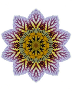
Image 1
2.  Kaleidoscope effect with different settings - horizontal offset 100%, vertical offset -63%, angle 152, scale -4, 7 petals, radial suction 39.
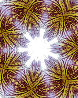
Image 2


3. Kaleidoscope effect again applied to the saturated image of flower head 3 (see last post)  with settings - 6 petals, angle 274, scale -31, edge mode set at wrap.
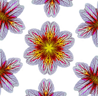
Image 3

4. Pattern effect - horizontal offset 68%, vertical offset 62%, rotation 90, 3 columns and 3 rows.
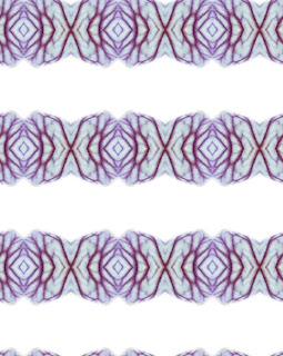
Image 4
 5. Flower head 1 and feedback effect.  I used the randomiser which came up with these settings - opacity 85%, horizontal 28, intensity 95, vertical -93, elliptical.  I like the build up of overlapping petals in this one and the repeated shapes - could be the start of an idea for a 3d piece?  I see it as a long trailing cloak, perhaps a stage costume. It could either be very stiff and heavy with the layers standing apart (think Sydney Opera House) for a haughty queen  or soft and light for a gentle character. Not so keen on the colour (too bland) so I would reintroduce the gold/yellow shades.
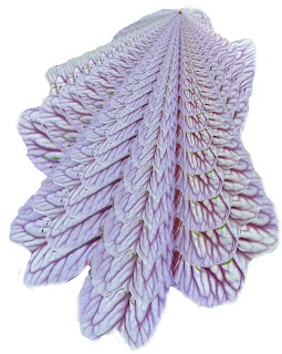
Image 5


6. Image 5 repeated, flipped, layered.  Seems to have turned into bird's wings.
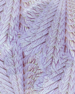
Image 6
 I mentioned before that I had done a little bit of drawing over the summer - image 7 shows the sketches.  On the right are a rose in fine black pen and red marker pen; bottom right corner a gladioli (gladiolus?) in soluble pencils; left side using soluble pencils to explore shapes and colours from my flower photos; top left drawing the shapes from image 5.
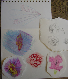
Image 7
 The next few photos are different drawings from the photos.   I have included a 2p coin (1") for scale as they are different sizes.

  
Image 8
 Image 8 is soft pastels, image 9 is Markal sticks.  I like the energy in this one, although it looks more like a dahlia than the original flower.
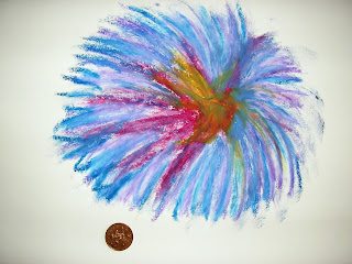
Image 9
Image 10  - soft pastels on black paper.
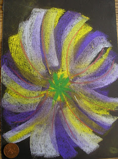
Image 10      
Next come the decorated papers, these are all A3 sheets. First is just stripes of colours.

Image 11
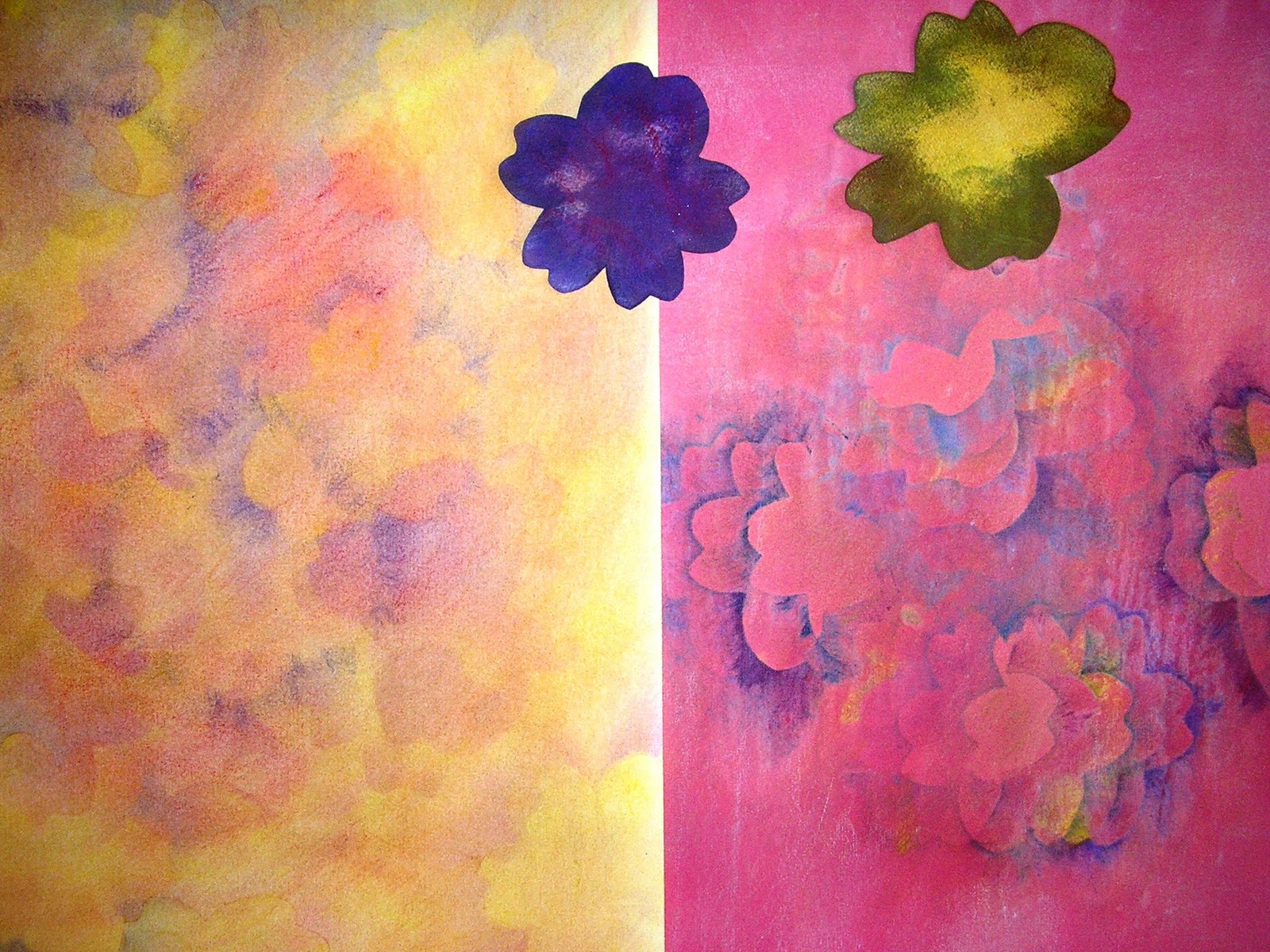
 Next I cut out card templates of the flower head and used it to rub off soft pastels (left) and Markal sticks (right). I washed the right hand one with ink but didn't like the colour, so I added pastels on top to tone it down.  You can see the templates on top of the papers.
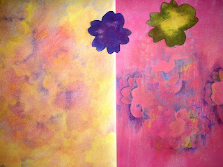
Image 12
 Next, I made a string block in the shape of the petals and used it for two more papers. Image 13 is a rubbing with Markal sticks.
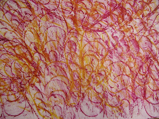
Image 13
Image 14 is the block pressed into a layer of gesso and coloured with soft pastels and also shows the block.
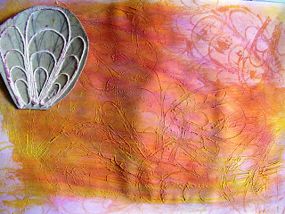
Image 14
And finally, I couldn't resist trying this - a pylon photo repainted with image 14, more fun than grey.
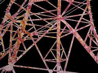
Image 15

Friday, November 19, 2010

Module 4 Chapter 3 - part 1


Following on from my last post - at Sian's suggestion, I have added a postscript to the virtual sketchbook for Glimpsing the Storm explaining how I used a telescopic pole to make it freestanding - you never know when it may be useful.

For chapter 3, I am exploring ideas that could be turned into 'slips' for embroidery, based on flowers.  I did sort of start doing this in the summer and sketched a couple of flowers but now we are in November, I have turned to my photo collections for inspiration.  I found I had rather a lot of close-ups of flowers, so I chose three to work with; two are from a visit to the National Botanical Gardens of Wales (I don't know what the flowers are - can anyone enlighten me?) and the third is a rose from our garden.

Source photo 1

Source Photo 2

Source photo 3
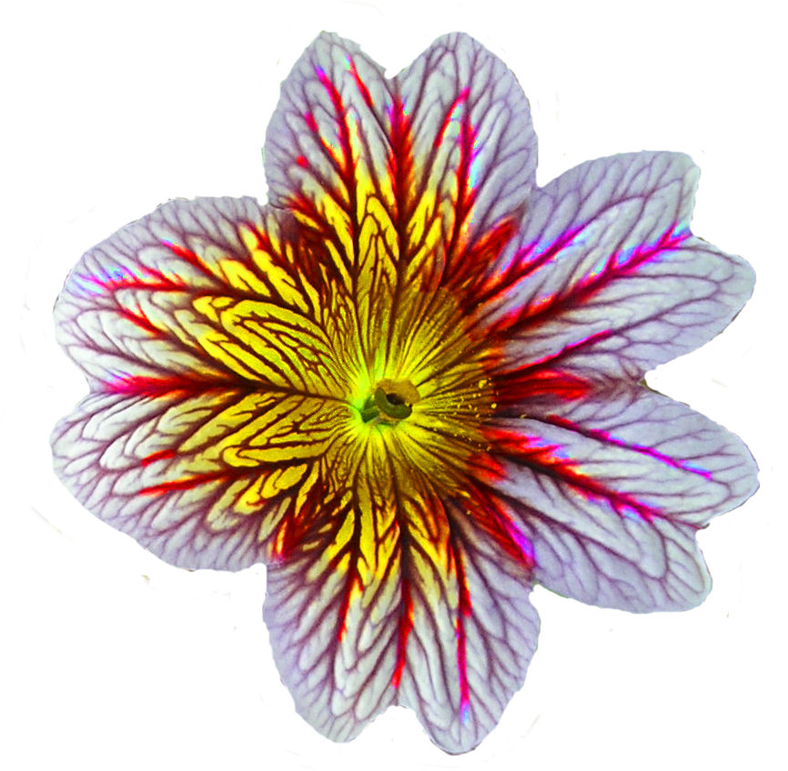
 Then I played in Paint Shop Pro - the first step was to isolate 3 of the flowers by using lassoo selection and pasting as a new image, which has a transparent background. 


Flower head 1

Flower head 2

Flower head 3


Then I created the following images

1. Flower head 1 changed to greyscale and applied black pencil effect.  Suggests a padded or quilted piece.
Image 1
2. Flower head 1 with rough leather texture effect

Image 2
3. Image 2 layered on top of a copy of flower head 1 with the opacity of the top layer reduced to 44%.  I used the eraser to rub away parts of the centre of the top layer to reveal the colours beneath and applied the rough leather texture again. 
Image 3

4.Flower head 3 with the details softened by the smudge brush.

Image 4
 5. Flower head 3 with the hue brush applied
Image 5


 6.Flower head 3 with saturation brush
Image 6
7. Three copies of flower head 1 layered up slightly misaligned and opacity reduced between layers to 50%. I tidied up the image by using the eraser and the clone brush to remove the extra stalks and  fill the gap with nearby colours, and then ran the soften brush around the edge. This image is less harsh than the original photo and suggests silk shading or layers of sheers.  Or the softness could be translated into felt.
Image7
8. I wanted to try using the shape of flower head one as a template so I used it as a mask layer on source photo 3.  I had an idea of it being crammed full of petals or flowers - this trial doesn't look right so I may come back to it, I may be able to play with the scale.
Image 8
9. I printed out copies of all these images to make up sketchbook pages and when I was cutting them out, I put one on a background and took a  photo.  The background is a used piece of TAP (I had been experimenting with transferring an image onto a collage of fabric scraps but the printer ran out of coloured ink and produced a peculiar colour.  I went ahead anyway to see how the fabrics took the transfer and it left behind a lovely grungy texured image on the paper).

Image 9
10. I scanned in the sheet of TAP, put image 7 on top and cropped to a square.

Image 10
11. I pulled out an image from my module 1 study of pylons which was a scan of a paper rubbing and used it as a background.  On top, I used flower head 3 which I had manipulated as for image 7.

Image 11