Showing posts with label colour. Show all posts

Saturday, July 16, 2011

Module 4 chapter 9 Section C


Umm - these videos were supposed to be much further down the post but somehow they have ended up here as well.  I have no idea why and now I can neither delete nor move them, which rather spoils my layout, but I can't face doing the whole post again.  I just hope they work  - please let me know if they don't.

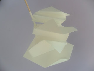
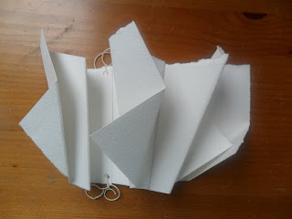
Exercise 1 - using a simple shape to make a series of 3d shapes.  I started with a set of squares torn from watercolour paper and folded them in sequence.  Photo 1 shows the way they were folded, photo 2 is one way of arranging them and photo 3 is the final choice with the pieces tied together - I omitted the last one as it didn't seem to fit in.
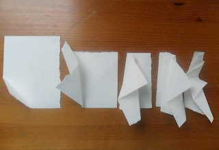
Photo 1

Photo 2

Photo 3
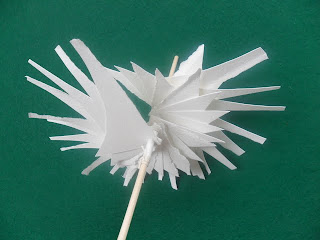
Exercise 2 Graded positive and negative shapes. Photo 4 shows the cut shapes, which I repeated many times.
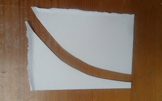
Photo 4
Photo 5 - the chunky shape curved by gentle rubbing and speared on a dowel in a spiral.
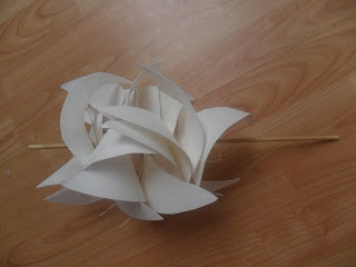
Photo 5
Photo 6 - another view with stronger shadows.
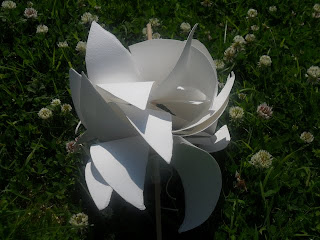
Photo 6

Photo 7 - the skinny shape spiralling on a dowel - I took it outside to get stronger shadows which adds an extra layer.  Photo 8 is included so you can see from a different angle how is spirals round along 3 or 4 inches of the doweland how the short and long ends create patterns.
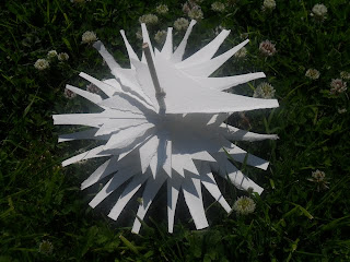
photo 7
Photo 8

 When I was trying to photograph this one from above, it wouldn't keep still until I stuck it in the ground.  However, as you know I love to have things moving and watching kinetic sculptures*, so I took a short video to see the effect - this could be fun with colour effects or with some kind of background that is glimpsed as it turns (back on animations and cogs again).


Exercise 3 Using colour and 3d shapes.  For this exercise, I returned to the petal shape and used two photocopies of painted papers stuck together. Photo 9 shows the shape simply slotted together.
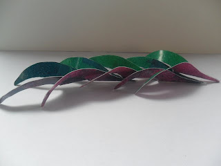
Photo 9
 Photo 10 a more interesting arrangement - it puts me in mind of dancers practising at the barre.
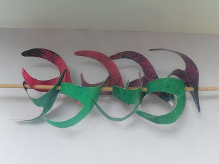
Photo 10

Again, a short video to show how it looks from different angles and the effect of the colours moving around.

*you can see some here and here.

Thursday, June 23, 2011

Module 4 Chapter 9 Section A Exercise 3 again


Something odd has been happening with these photos so I have re-posted them in the hope that this time they will enlarge for a closer look.
Posted by Picasa

Module 4 Chapter 9 Section B

Exercise 1
The shape I chose to use is taken from the petals of the flower photos used earlier in this module - I cut  out templates in graduated sizes. Image 1   - looking at just the shape by arranging the templates.
Image 11
Arranging cut out shapes on contrasting backgrounds - images 12 and 13, both A5 size.  Image 12 has turned into a bird, image 13 could do with more contrast to show the shapes more clearly.
Image 12

Image 13
 Combining cut outs with negative shapes on different backgrounds - images 14 and 15.
Image 14

Image 15
Image 15 also show some arrangements on copies of the tonal paper.

Wednesday, June 22, 2011

Module 4 chapter 9 Section A - part 1


Image 1
Section A Exercise 1
For these exercises, I worked with two colours of acrylic paint - quincridone violet and pthalo green. Image 1 shows the range of colours from mixing the two and image 2 is a combination of photos showing various ways I tried of combining colours.
Image 2
Image 3 below shows the final choices pinned on a board.
Image 3
I particularly like the stormy blue/greens in this colour scheme, although they haven't photographed well, and the calmness of the composition top left in image 3.   I think the pair in the centre of the top row of image 3 could be the start point for a hanging  (it isn't very clear but the top and bottom sections are different colours) and I like the  "cityscape" on the bottom left.  I cheated a bit with these last two and added some silver lines to give them a bit more definition.
Exercise 2
I used the same paints to make some backgrounds on A4 sheets, using sponges to mix the colours freely on the paper in contrast to the rectilinear blocks of colour from exercise 1.  I played with lots of combinations of the torn papers on backgrounds, shown in image 4, and then selected two to keep.
Image 4